ARTI O.M.
Where well-being takes shape, identity, and digital presence.
Year
2025
Client
ARTI O.M.
Type
External
Involved Areas
Communication, Data Analysis, Design, IT, Marketing, Sales, Videomaking
Services
The Initiative
The ARTI O.M. project was created to build a visual identity capable of communicating authentic well-being, conveying values of care, harmony, lightness, and elegance.
The identity is a coherent system designed to elevate the center’s experience and make it memorable for the client, both online and offline.
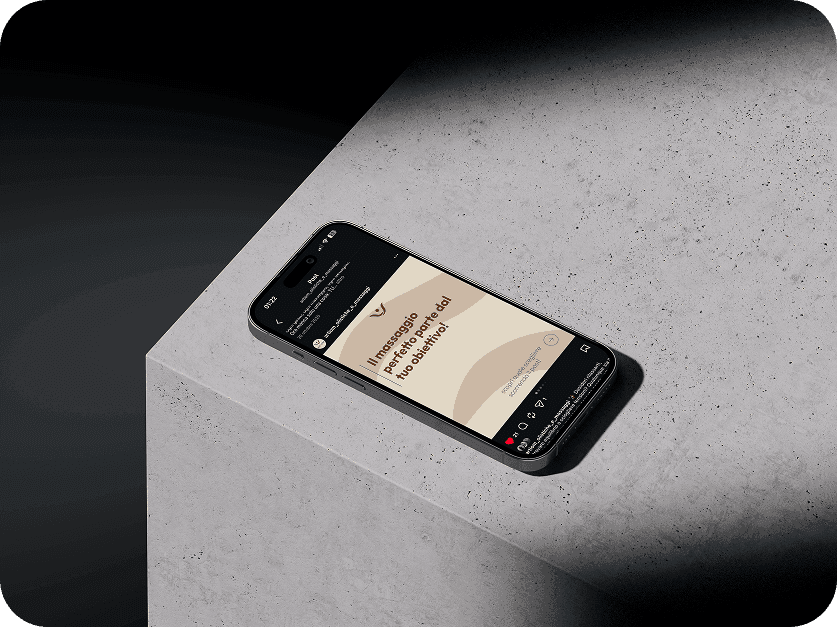
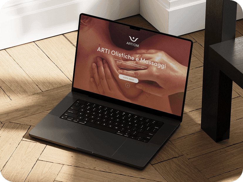
One of the key requirements was to make the brand’s positioning clearly recognizable through digital channels, such as Instagram, supporting the launch and the first campaigns. An effective web presence was developed through a coherent and functional Landing Page aimed at presenting the services.
Discovery Phase
Discovery Phase
The preliminary analysis for optimization and management highlighted a solid concept. Creating the brand identity from scratch made it possible to develop a unified and strategic visual system, capable of faithfully reflecting the experience offered by the center from the very beginning.
The competitive context required strong visual differentiation to avoid generic solutions. It was crucial to balance emotional communication with informational clarity, maintaining high quality and consistency even in performance-oriented advertising activities.
The main technical challenge was to develop a professional and streamlined web solution, capable of enhancing the visual identity without the complexity of a multi-page website, optimizing both available resources and timelines.
Operational Phase
Operational Phase
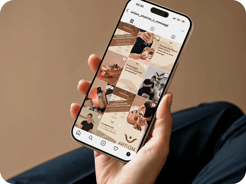
The project started with a competitor analysis, identifying the distinctive strengths of ARTI O.M. These insights defined the guidelines for the visual identity, which were then translated into materials for social media. At the same time, a WordPress Landing Page was developed to summarize the brand’s services and values.
The technical phase included the integration of plugins, such as a carousel system for visual content. Great attention was dedicated to graphic consistency between the website and social media, text readability, and the fluidity of the user experience to ensure intuitive navigation.
The work was carried out iteratively, maintaining constant alignment between the initial strategy, the visual design, and the practical applications across the different digital channels.
Results
Results
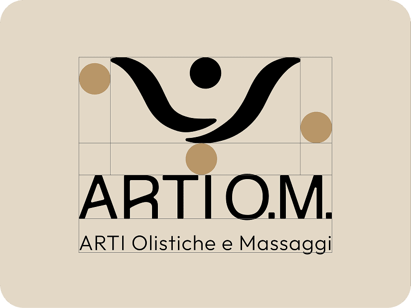
The project led to the definition of a clear, recognizable, and coherent visual identity, with a central logo immediately associated with the brand, capable of facilitating recognition across all touchpoints. A warm and reassuring visual imagery was created, aligned with the center’s positioning and able to convey well-being, care, and professionalism.
The graphic consistency across the materials, achieved through the controlled repetition of distinctive signs and shapes, strengthened the perception of a unified and structured system. The social media presence also became more organized and recognizable, while the Landing Page, consistent with the developed identity, consolidated the center’s digital presence by presenting services and activities in a clear and professional way.